pacman::p_load(plotly, ggtern, tidyverse)Hands-on Exercise 9.1 - Creating Ternary Plot with R
1.Overview
Ternary plots are an effective way to visualize the distribution and variability of three-part compositional data. Examples include population structure (e.g., proportions of young, economically active, and aged populations) or soil composition (e.g., proportions of sand, silt, and clay). The plot is represented as a triangle, with each side scaled from 0 to 1, corresponding to one of the three components. A data point is positioned such that perpendicular lines drawn from the point to each side intersect at values representing its component proportions.
In this exercise, we explore how to programmatically create ternary plots in R to analyze and visualize Singapore’s population structure. The exercise consists of four key steps:
Install and load required packages: tidyverse and ggtern.
Derive new measures: Use the
mutate()function from the dplyr package to calculate three new proportions.Create a static ternary plot: Utilize the
ggtern()function from the ggtern package.Build an interactive ternary plot: Use the
plot_ly()function from the Plotly package
2. Installing and launching R packages
In this hands-on exercise, we will use two primary R packages:
ggtern – A specialized extension of ggplot2 designed for creating ternary diagrams. This package will be used to generate static ternary plots.
Plotly R – A package that enables the creation of interactive web-based graphs using the
plotly.jsJavaScript library. Theggplotly()function from this package will convert ggplot2 figures into interactivePlotlyobjects.
Additionally, we will need selected packages from the tidyverse ecosystem, including:
readrfor reading data filesdplyrfor data manipulationtidyrfor reshaping data
Important Note:
For compatibility reasons, version 3.2.1 of ggplot2 will be installed instead of the latest version, as the current version of ggtern is not fully compatible with the most recent ggplot2 release.
The following code chunks handles the installation and loading of the required packages.
3. Data Preparation
3.1. The data
For the purpose of this hands-on exercise, the Singapore Residents by Planning AreaSubzone, Age Group, Sex and Type of Dwelling, June 2000-2018 data was downloaded and transformed into respopagsex2000to2018_tidy.csv.
3.2. Importing Data
We use read_csv() function to import respopagsex2000to2018_tidy.csv into R as pop_data tibble dataframe.
#Reading the data into R environment
pop_data <- read_csv("data/respopagsex2000to2018_tidy.csv")
3.3. Preparing the Data
Next, we use mutate() dplyr package to derive three new measures, namely: young, active, and old.
#Deriving the young, economy active and old measures
agpop_mutated <- pop_data %>%
  mutate(`Year` = as.character(Year))%>%
  spread(AG, Population) %>%
  mutate(YOUNG = rowSums(.[4:8]))%>%
  mutate(ACTIVE = rowSums(.[9:16]))  %>%
  mutate(OLD = rowSums(.[17:21])) %>%
  mutate(TOTAL = rowSums(.[22:24])) %>%
  filter(Year == 2018)%>%
  filter(TOTAL > 0)
4.Plotting Ternary Diagram with R
4.1. Plotting a static ternary diagram
The below code chunk uses ggtern() of ggtern package to create a simple ternary plot.
#Building the static ternary plot
ggtern(data=agpop_mutated,aes(x=YOUNG,y=ACTIVE, z=OLD)) +
  geom_point()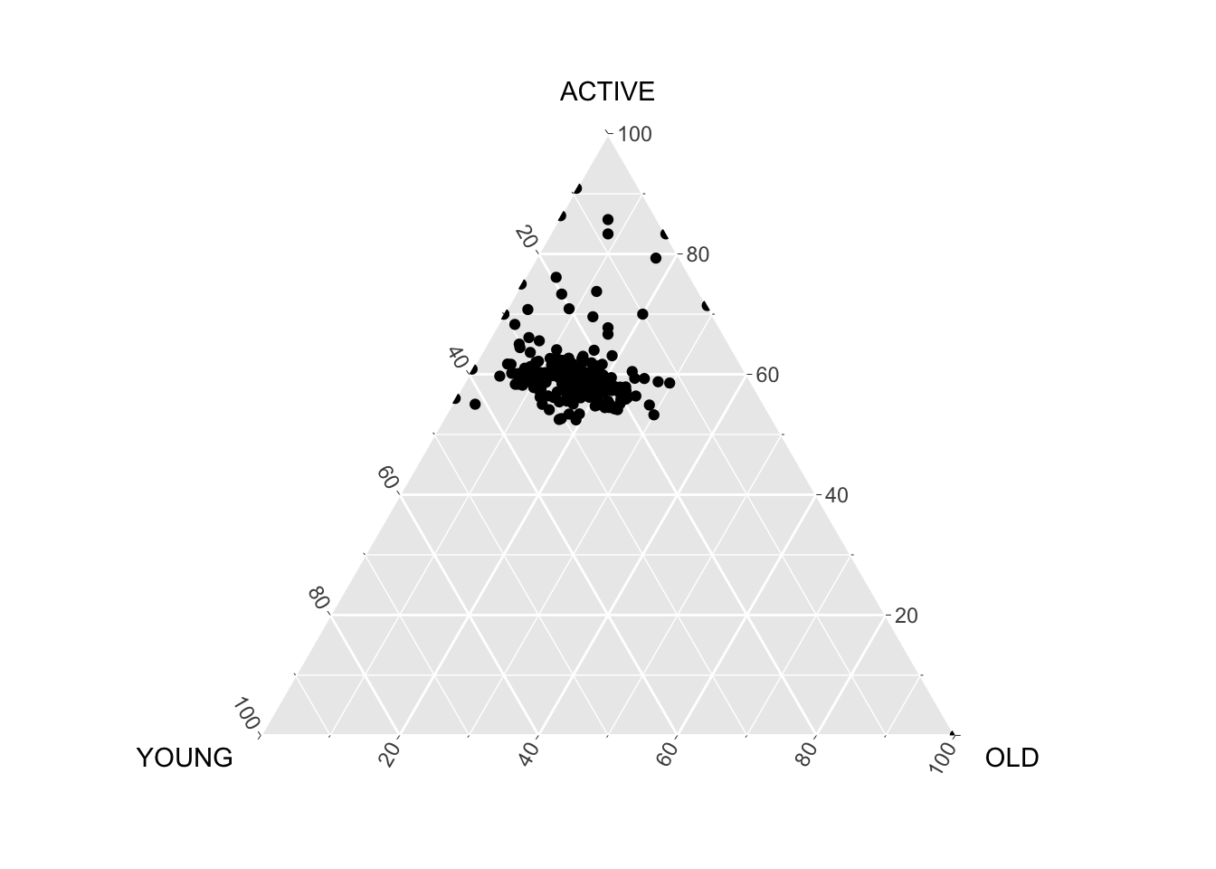
#Building the static ternary plot
ggtern(data=agpop_mutated, aes(x=YOUNG,y=ACTIVE, z=OLD)) +
  geom_point() +
  labs(title="Population structure, 2015") +
  theme_rgbw()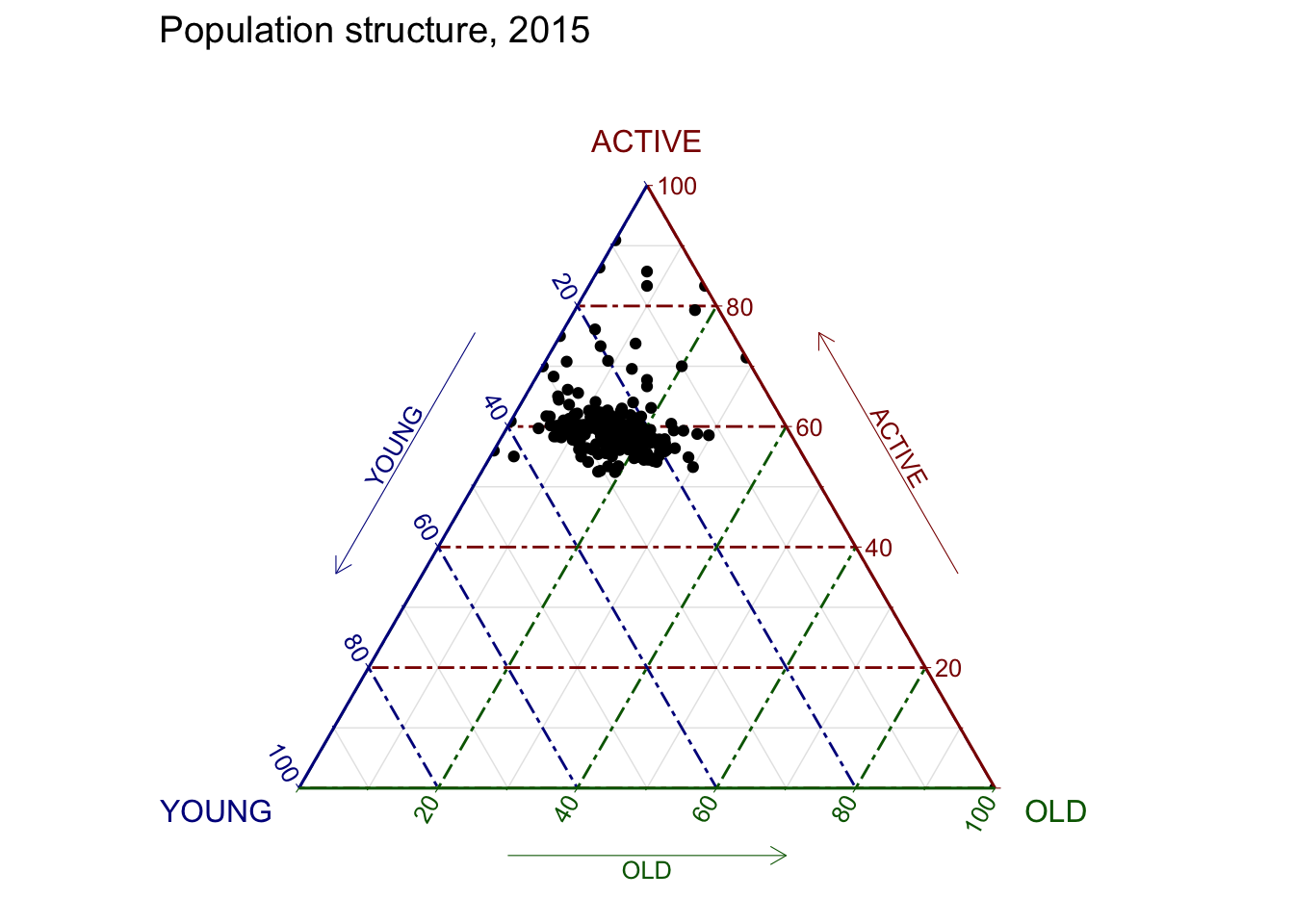
4.2. Plotting an interative ternary diagram
The code below creates an interactive ternary plot using plot_ly() function of Plotly R.
# reusable function for creating annotation object
label <- function(txt) {
  list(
    text = txt,
    x = 0.1, y = 1,
    ax = 0, ay = 0,
    xref = "paper", yref = "paper",
    align = "center",
    font = list(family = "serif", size = 15, color = "white"),
    bgcolor = "#b3b3b3", bordercolor = "black", borderwidth = 2
  )
}

# reusable function for axis formatting
axis <- function(txt) {
  list(
    title = txt, tickformat = ".0%", tickfont = list(size = 10)
  )
}

ternaryAxes <- list(
  aaxis = axis("Young"),
  baxis = axis("Active"),
  caxis = axis("Old")
)

# Initiating a plotly visualization
plot_ly(
  agpop_mutated,
  a = ~YOUNG,
  b = ~ACTIVE,
  c = ~OLD,
  color = I("black"),
  type = "scatterternary"
) %>%
  layout(
    annotations = label("Ternary Markers"),
    ternary = ternaryAxes
  )