pacman::p_load(ggdist, ggridges, ggthemes,
colorspace, tidyverse)Hands-on Exercise 4.1 - Visualising Distribution
1. Learning Outcome
Visualizing distributions is a fundamental aspect of statistical analysis. While Chapter 1 introduced common methods like histograms, density curves, boxplots, notch plots, and violin plots using ggplot2, this chapter explores two relatively new and effective techniques: ridgeline plots and raincloud plots. We will demonstrate how to create these visualizations using ggplot2 and its extensions.
2. Getting Started
2.1 Installing and loading the packages
For this exercise, we will utilize the following R packages:
ggridges: For creating ridgeline plots.ggdist: For visualizing distributions and uncertainty.tidyverse: A collection of R packages for data science and visualization.ggthemes: To access additional themes, scales, and geoms for ggplot2.colorspace: To provide a comprehensive toolbox for color selection and manipulation.
The code chunk below loads these packages into Rstudio environment.
2.2. Data import
A dataset named Exam_data is used in this section. It contains year-end examination scores for a cohort of Primary 3 students from a local school and is stored in CSV format.
The read_csv() function from the readr package, part of the tidyverse, is applied to import the file:
exam <- read_csv("data/Exam_data.csv", show_col_types = FALSE)📋 Preview of the data:
| ID | CLASS | GENDER | RACE | ENGLISH | MATHS | SCIENCE |
|---|---|---|---|---|---|---|
| Student321 | 3I | Male | Malay | 21 | 9 | 15 |
| Student305 | 3I | Female | Malay | 24 | 22 | 16 |
| Student289 | 3H | Male | Chinese | 26 | 16 | 16 |
| Student227 | 3F | Male | Chinese | 27 | 77 | 31 |
| Student318 | 3I | Male | Malay | 27 | 11 | 25 |
| Student306 | 3I | Female | Malay | 31 | 16 | 16 |
3. Visualising Distribution with Ridgeline Plot
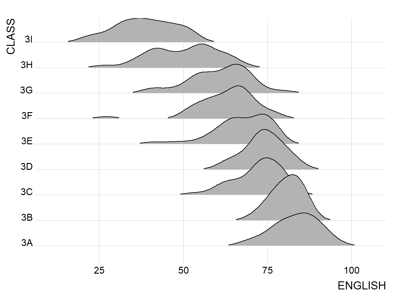
Ridgeline plot also known as Joyplots, are a visualization technique that effectively reveals the distribution of a numeric value across multiple groups. They present a series of density plots or histograms, aligned on the same horizontal scale with slight overlap, allowing for easy comparison of distributions between groups.
The figure below illustrates a ridgeline plot showcasing the distribution of English scores across different classes.
Tip
Ridgeline plots are most effective when visualizing the distribution of a numeric variable across multiple groups, especially when the number of groups is moderate to high. Their overlapping nature allows for efficient space utilization compared to traditional methods with separate windows for each group. However, if you have fewer than five groups, other distribution plots might be more suitable.
These plots are useful when a clear pattern or ranking exists among the groups. Otherwise, excessive overlap between the distributions can lead to a cluttered and uninterpretable plot, hindering insights.
3.1. Plotting ridgeline graph: ggridges method
Several methods exist for creating ridgeline plots in R. This section focuses on using ggridges package, which provides two primary geoms for this purpose:
geom_ridgeline(): This geom directly uses height values to draw the ridgelines.geom_density_ridges(): This geom first estimates data densities and then draws the ridgelines based on these density estimates.
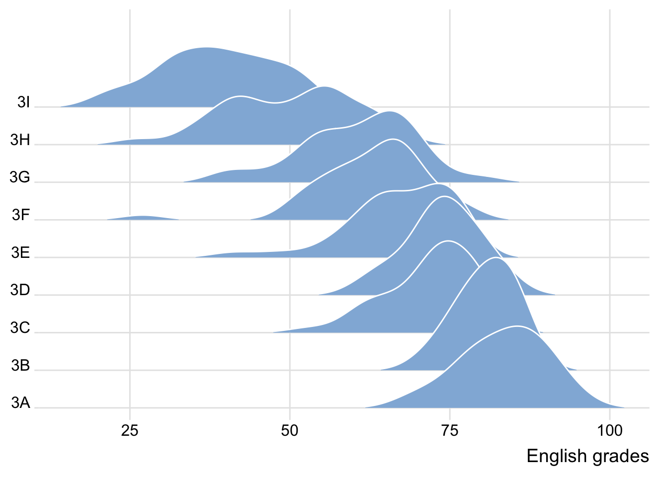
The following ridgeline plot is created using geom_density_ridges()
ggplot(exam,
       aes(x = ENGLISH,
           y = CLASS)) +
  geom_density_ridges(
    scale = 3,
    rel_min_height = 0.01,
    bandwidth = 3.4,
    fill = lighten("#7097BB", .3),
    color = "white"
  ) +
  scale_x_continuous(
    name = "English grades",
    expand = c(0, 0)
    ) +
  scale_y_discrete(name = NULL, expand = expansion(add = c(0.2, 2.6))) +
  theme_ridges()
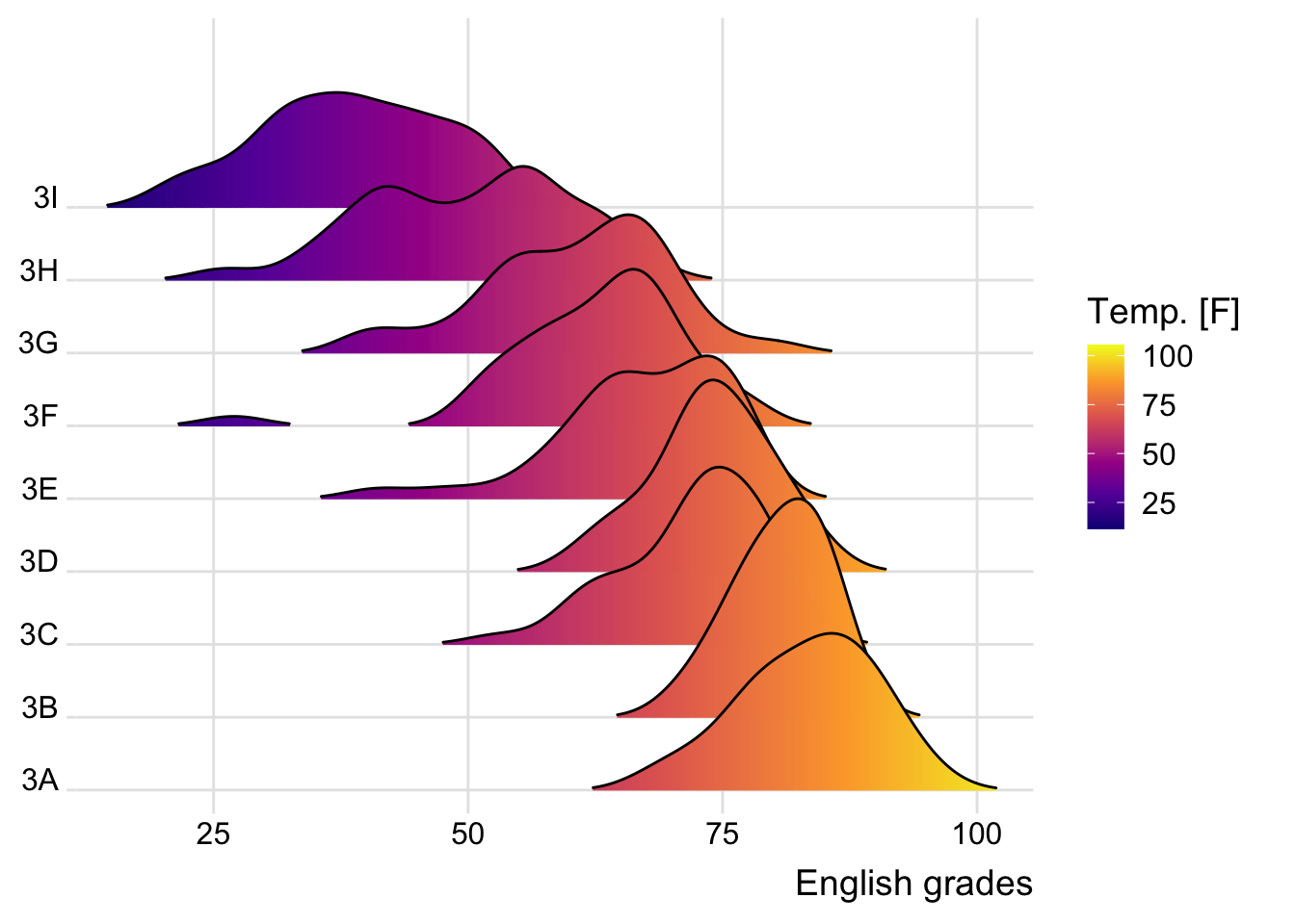
3.2. Varying fill colors along the x axis
Sometimes we desire ridgeline plots where the area under each curve is not filled with a single solid color but rather with a gradient of colors along the x-axis. This effect can be achieved using either geom_ridgeline_gradient() or geom_density_ridges_gradient(). These functions operate similarly to geom_ridgeline() and geom_density_ridges(), respectively, but with the added capability of varying fill colors. However, it’s important to note that these functions currently do not support both changing fill colors and transparency simultaneously.
ggplot(exam,
       aes(x = ENGLISH,
           y = CLASS,
           fill = stat(x))) +
  geom_density_ridges_gradient(
    scale = 3,
    rel_min_height = 0.01) +
  scale_fill_viridis_c(name = "Temp. [F]",
                       option = "C") +
  scale_x_continuous(
    name = "English grades",
    expand = c(0, 0)
  ) +
  scale_y_discrete(name = NULL, expand = expansion(add = c(0.2, 2.6))) +
  theme_ridges()
3.3. Mapping the probabilities directly onto colour
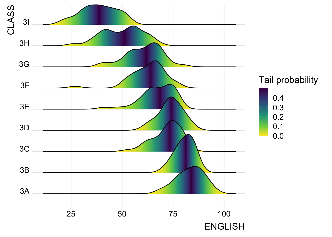
The ggridges package not only provides specialized geoms for creating ridgeline plots but also offers stat_density_ridges(), a function that replaces stat_density() from ggplot2. This function is specifically designed for use within the ggridges package.
The figure below illustrates a ridgeline plot created by mapping the probabilities calculated using stat(ecdf), which represents the empirical cumulative density function for the distribution of English scores.
ggplot(exam,
       aes(x = ENGLISH,
           y = CLASS,
           fill = 0.5 - abs(0.5-stat(ecdf)))) +
  stat_density_ridges(geom = "density_ridges_gradient",
                      calc_ecdf = TRUE) +
  scale_fill_viridis_c(name = "Tail probability",
                       direction = -1) +
  theme_ridges()
It is important to include the argument calc_ecdf = TRUE in stat_density_ridges().
3.4. Ridgeline plots with quantile lines
Using geom_density_ridges_gradient(), we can colour the ridgeline plot by quantile using the calculated stat(quantile) aesthetic as shown in the figure below.
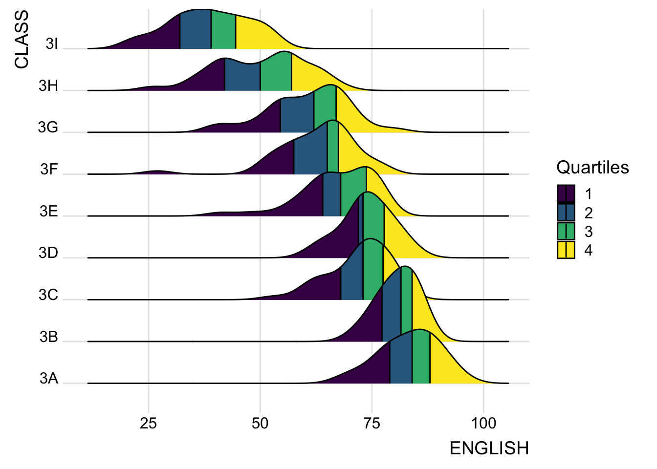
ggplot(exam,
       aes(x = ENGLISH,
           y = CLASS,
           fill = factor(stat(quantile))
           )) +
  stat_density_ridges(
    geom = "density_ridges_gradient",
    calc_ecdf = TRUE,
    quantiles = 4,
    quantile_lines = TRUE) +
  scale_fill_viridis_d(name = "Quartiles") +
  theme_ridges()
Instead of defining quantiles using numerical values, we can specify them by cut points such as 2.5% and 97.5% to color the ridgeline plot. This approach highlights the tails of the distribution, providing insights into extreme values.
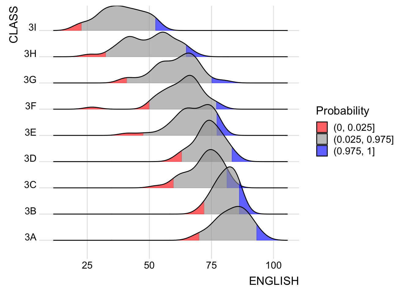
ggplot(exam,
       aes(x = ENGLISH,
           y = CLASS,
           fill = factor(stat(quantile))
           )) +
  stat_density_ridges(
    geom = "density_ridges_gradient",
    calc_ecdf = TRUE,
    quantiles = c(0.025, 0.975)
    ) +
  scale_fill_manual(
    name = "Probability",
    values = c("#FF0000A0", "#A0A0A0A0", "#0000FFA0"),
    labels = c("(0, 0.025]", "(0.025, 0.975]", "(0.975, 1]")
  ) +
  theme_ridges()
4. Visualising Distribution with Raincloud Plot
The Raincloud Plot is a visualization technique that combines a half-density plot with a box plot, creating a visual that resembles a raincloud. This approach enhances the traditional box plot by highlighting multiple modalities within the data distribution, which the box plot alone may not reveal.
In this section, we will learn how to create a raincloud plot to visualize the distribution of English scores across different racial groups. This will be achieved using functions from the ggdist and ggplot2 packages.
4.1. Plotting a Half Eye graph
We start by plotting a Half-Eye graph using stat_halfeye() from the ggdist package. This function creates a visualization that includes a half-density plot and a slab interval.
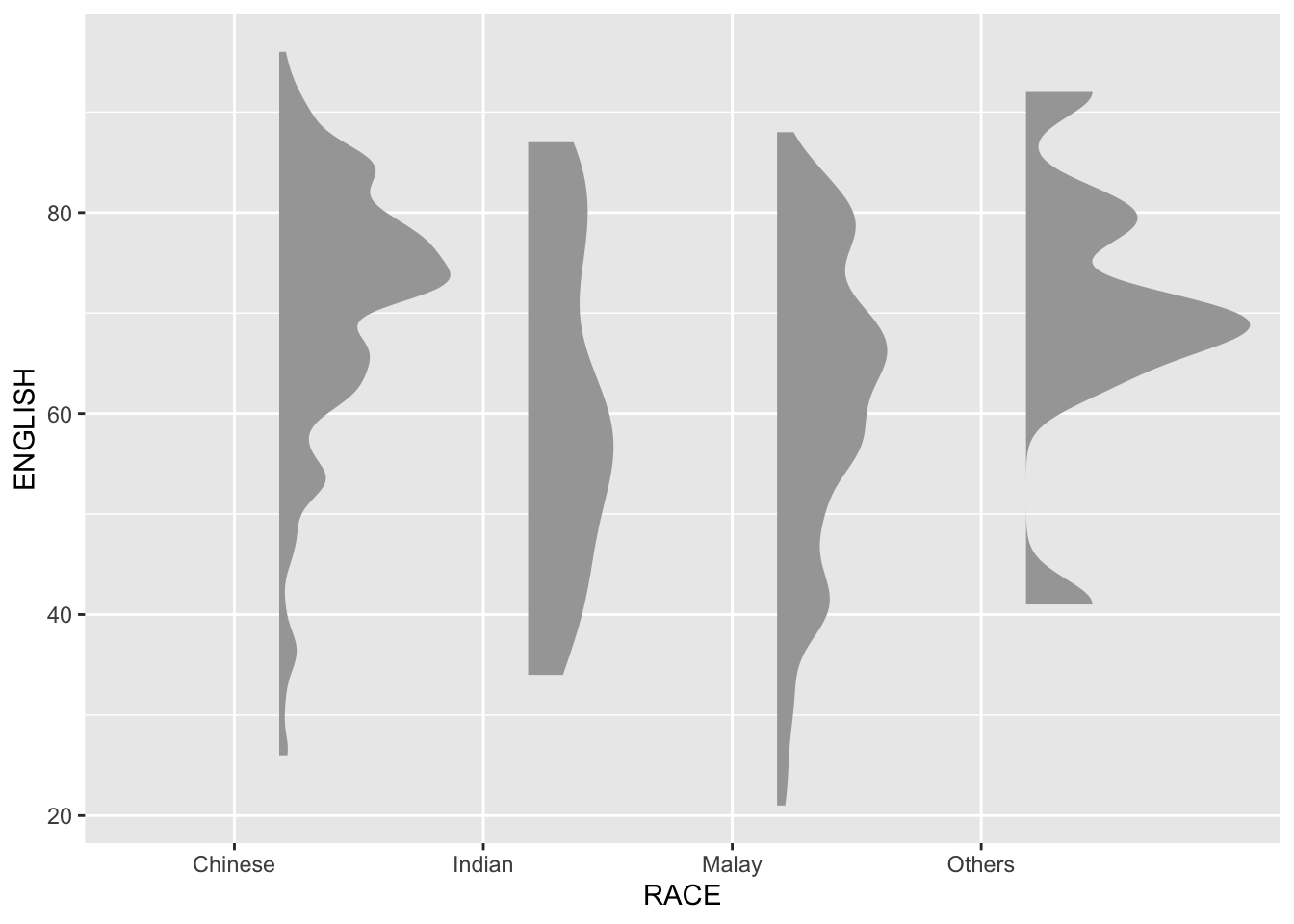
ggplot(exam,
       aes(x = RACE,
           y = ENGLISH)) +
  stat_halfeye(adjust = 0.5,
               justification = -0.2,
               .width = 0,
point_colour = NA)Note: The slab interval can be removed by setting .width = 0 and point_colour = NA.
4.2. Adding the boxplot with geom_boxplot()
Next, we add the second geometry layer using geom_boxplot() of ggplot2. This produces a narrow boxplot with reduced width and adjusted opacity.
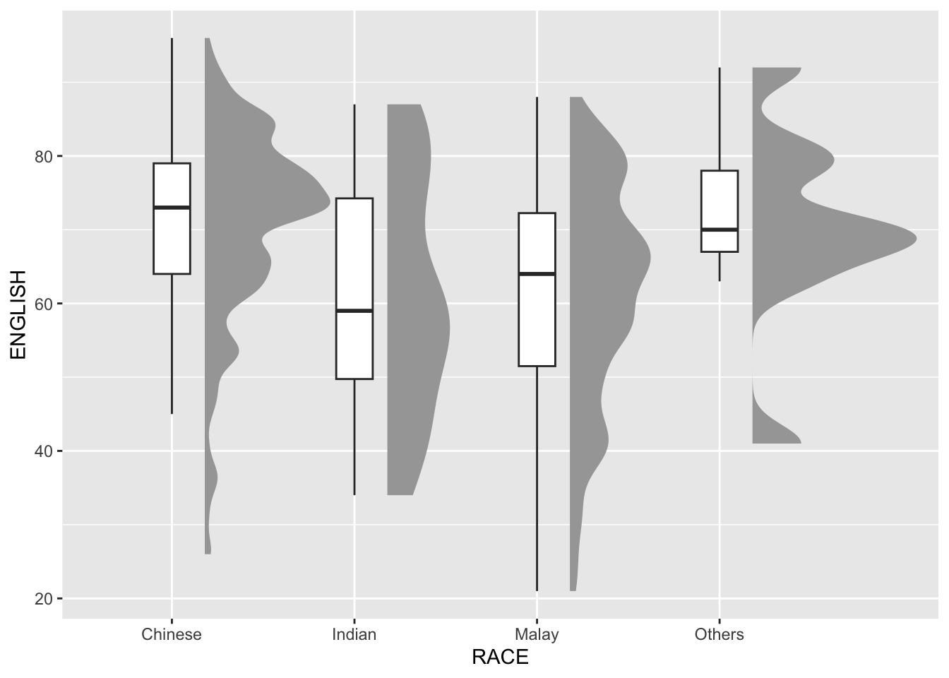
ggplot(exam,
       aes(x = RACE,
           y = ENGLISH)) +
  stat_halfeye(adjust = 0.5,
               justification = -0.2,
               .width = 0,
               point_colour = NA) +
  geom_boxplot(width = .20,
               outlier.shape = NA)
4.3 Adding the Dot Plots with stat_dots()
To enhance the visualization, we incorporate a third geometric layer using stat_dots() from the ggdist package. This creates a half-dotplot, which resembles a histogram and visually represents the number of samples (dots) within each bin. By setting side = "left", we position the dotplot to the left-hand side of the raincloud plot.
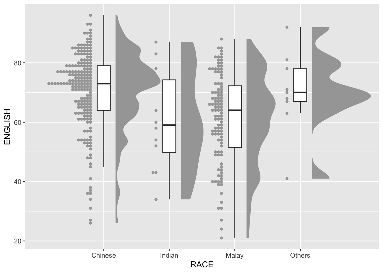
ggplot(exam,
       aes(x = RACE,
           y = ENGLISH)) +
  stat_halfeye(adjust = 0.5,
               justification = -0.2,
               .width = 0,
               point_colour = NA) +
  geom_boxplot(width = .20,
               outlier.shape = NA) +
  stat_dots(side = "left",
            justification = 1.2,
            binwidth = .5,
            dotsize = 2)
4.4. Finishing touch
Finally, coord_flip() from the ggplot2 package is employed to rotate the raincloud plot horizontally, creating the characteristic raincloud shape. Additionally, theme_economist() from the ggthemes package is applied to enhance the visual appeal of the plot, providing a professional and publication-ready aesthetic.
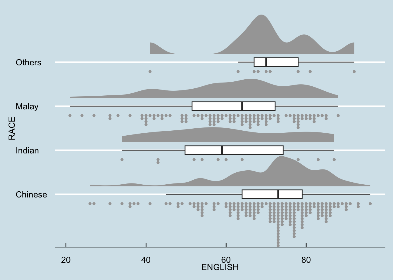
ggplot(exam,
       aes(x = RACE,
           y = ENGLISH)) +
  stat_halfeye(adjust = 0.5,
               justification = -0.2,
               .width = 0,
               point_colour = NA) +
  geom_boxplot(width = .20,
               outlier.shape = NA) +
  stat_dots(side = "left",
            justification = 1.2,
            binwidth = .5,
            dotsize = 1.5) +
  coord_flip() +
  theme_economist()
Practice: A more visually effective version
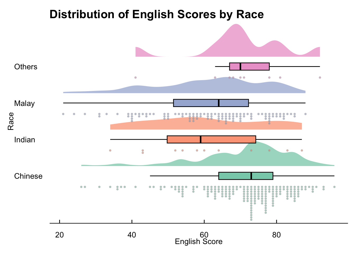
ggplot(exam, aes(x = RACE, y = ENGLISH, fill = RACE)) +
  stat_halfeye(
    adjust = 0.5,
    justification = -0.3,  # Slightly more space
    .width = 0,
    point_colour = NA,
    alpha = 0.6
  ) +
  geom_boxplot(
    width = 0.2,
    outlier.shape = NA,
    color = "black",
    alpha = 0.8
  ) +
  stat_dots(
    side = "left",
    justification = 1.3,
    binwidth = 0.5,
    dotsize = 1.3,
    alpha = 0.5
  ) +
  coord_flip() +
  scale_fill_brewer(palette = "Set2") +
  theme_economist() +
  theme(
    legend.position = "none",
    plot.background = element_rect(fill = "white", color = NA),
    panel.background = element_rect(fill = "white")
  ) +
  labs(
    title = "Distribution of English Scores by Race",
    x = "Race",
    y = "English Score"
  )
Reference
Claus O. Wilke Fundamentals of Data Visualization especially Chapter 6, 7, 8, 9 and 10.
Allen M, Poggiali D, Whitaker K et al. “Raincloud plots: a multi-platform tool for robust data. visualization” [version 2; peer review: 2 approved]. Welcome Open Res 2021, pp. 4:63.