devtools::install_github("wilkelab/ungeviz")Hands-on Exercise 4.3 - Visualising Uncertainty
1. Learning Outcome
Visualizing uncertainty is a crucial aspect of statistical analysis. This chapter provides hands-on experience in creating informative statistical graphics that effectively communicate uncertainty, including:
Plot statistical error bars: Utilize ggplot2
Create interactive error bars: Combine ggplot2, plotly, and DT
Advanced techniques: Using ggdist package
Generate Hypothetical Outcome Plots (HOPs): Utilize ungeviz package
2. Getting Started
2.1.Installing and loading the packages
For this exercise, we will utilize the following R packages:
tidyverse: A collection of R packages for data science tasks, including data manipulation, transformation, and visualization.
plotly: For creating interactive and dynamic plots.
gganimate: For generating animated plots that showcase changes over time or different conditions.
DT: For displaying interactive HTML tables, enabling features like sorting, filtering, and searching.
crosstalk: For implementing cross-widget interactions, such as linked brushing and filtering, to explore data relationships across different visualizations.
ggdist: For visualizing distributions and uncertainty in a visually appealing and informative manner.
pacman::p_load(ungeviz, plotly, crosstalk,
               DT, ggdist, ggridges,
               colorspace, gganimate, tidyverse)
2.2. Data import
Exam_data.csv will be used for this exercise.
A dataset named Exam_data is used in this section. It contains year-end examination scores for a cohort of Primary 3 students from a local school and is stored in CSV format.
The read_csv() function from the readr package, part of the tidyverse, is applied to import the file:
exam <- read_csv("data/Exam_data.csv", show_col_types = FALSE)📋 Preview of the data:
| ID | CLASS | GENDER | RACE | ENGLISH | MATHS | SCIENCE |
|---|---|---|---|---|---|---|
| Student321 | 3I | Male | Malay | 21 | 9 | 15 |
| Student305 | 3I | Female | Malay | 24 | 22 | 16 |
| Student289 | 3H | Male | Chinese | 26 | 16 | 16 |
| Student227 | 3F | Male | Chinese | 27 | 77 | 31 |
| Student318 | 3I | Male | Malay | 27 | 11 | 25 |
| Student306 | 3I | Female | Malay | 31 | 16 | 16 |
3. Visualizing the uncertainty of point estimates: ggplot2 methods
A point estimate is a single value, such as a mean, while uncertainty is represented by measures like standard error, confidence interval, or credible interval.
Important
It’s crucial to distinguish the uncertainty of a point estimate from the variation within a sample.
In this section, we explore how to plot error bars for math scores by race using data from the exam tibble.
First, the code chunk below calculates the necessary summary statistics.
my_sum <- exam %>%
  group_by(RACE) %>%
  summarise(
    n=n(),
    mean=mean(MATHS),
    sd=sd(MATHS)
    ) %>%
  mutate(se=sd/sqrt(n-1))
Key takeaways from the above code chunk
group_by()(dplyr): Groups observations by RACE.summarise(): Computes count, mean, and standard deviation.mutate(): Calculates the standard error of math scores by RACE.The final output is stored as a tibble named my_sum.
Next, the code chunk below is used to display my_sum tibble data frame in an html table format.
knitr::kable(head(my_sum), format = 'html')| RACE | n | mean | sd | se |
|---|---|---|---|---|
| Chinese | 193 | 76.50777 | 15.69040 | 1.132357 |
| Indian | 12 | 60.66667 | 23.35237 | 7.041005 |
| Malay | 108 | 57.44444 | 21.13478 | 2.043177 |
| Others | 9 | 69.66667 | 10.72381 | 3.791438 |
3.1 Plotting standard error bars of point estimates
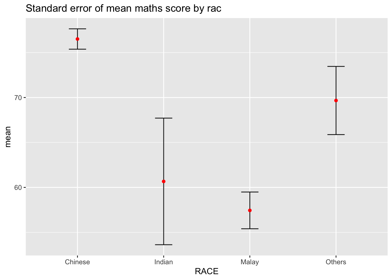
Now we can plot the standard error bars of mean maths score by race as shown below.
ggplot(my_sum) +
  geom_errorbar(
    aes(x=RACE,
        ymin=mean-se,
        ymax=mean+se),
    width=0.2,
    colour="black",
    alpha=0.9,
    size=0.5) +
  geom_point(aes
           (x=RACE,
            y=mean),
           stat="identity",
           color="red",
           size = 1.5,
           alpha=1) +
  ggtitle("Standard error of mean maths score by rac")
Key takeaways from the above code chunk
The error bars are computed using the formula mean+/-se.
For
geom_point(), it is important to indicate stat=“identity”.
3.2. Plotting confidence interval of point estimates
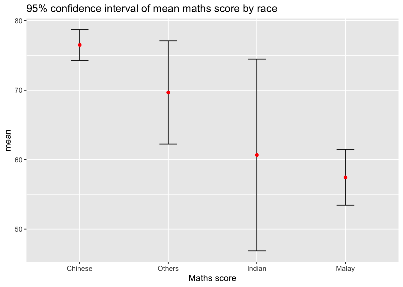
Instead of plotting the standard error bar of point estimates, we can also plot the confidence intervals of mean maths score by race.
ggplot(my_sum) +
  geom_errorbar(
    aes(x=reorder(RACE, -mean),
        ymin=mean-1.96*se,
        ymax=mean+1.96*se),
    width=0.2,
    colour="black",
    alpha=0.9,
    size=0.5) +
  geom_point(aes
           (x=RACE,
            y=mean),
           stat="identity",
           color="red",
           size = 1.5,
           alpha=1) +
  labs(x = "Maths score",
       title = "95% confidence interval of mean maths score by race")
Key takeaways from the above code chunk
The confidence intervals are computed using the formula mean+/-1.96*se.
The error bars is sorted using the average maths scores.
labs()argument of ggplot2 is used to change the x-axis label.
3.3. Visualizing the uncertainty of point estimates with interactive error bars
In this section, we explore how to plot interactive error bars for the 99% confidence interval of mean maths score by race as shown in the figure below.
shared_df = SharedData$new(my_sum)

bscols(widths = c(4,8),
       ggplotly((ggplot(shared_df) +
                   geom_errorbar(aes(
                     x=reorder(RACE, -mean),
                     ymin=mean-2.58*se,
                     ymax=mean+2.58*se),
                     width=0.2,
                     colour="black",
                     alpha=0.9,
                     size=0.5) +
                   geom_point(aes(
                     x=RACE,
                     y=mean,
                     text = paste("Race:", `RACE`,
                                  "<br>N:", `n`,
                                  "<br>Avg. Scores:", round(mean, digits = 2),
                                  "<br>95% CI:[",
                                  round((mean-2.58*se), digits = 2), ",",
                                  round((mean+2.58*se), digits = 2),"]")),
                     stat="identity",
                     color="red",
                     size = 1.5,
                     alpha=1) +
                   xlab("Race") +
                   ylab("Average Scores") +
                   theme_minimal() +
                   theme(axis.text.x = element_text(
                     angle = 45, vjust = 0.5, hjust=1)) +
                   ggtitle("99% Confidence interval of average /<br>maths scores by race")),
                tooltip = "text"),
       DT::datatable(shared_df,
                     rownames = FALSE,
                     class="compact",
                     width="100%",
                     options = list(pageLength = 10,
                                    scrollX=T),
                     colnames = c("No. of pupils",
                                  "Avg Scores",
                                  "Std Dev",
                                  "Std Error")) %>%
         formatRound(columns=c('mean', 'sd', 'se'),
                     digits=2))
4. Visualising Uncertainty: ggdist package
ggdist is an R package that enhances ggplot2 by providing flexible geoms and statistical functions specifically designed for visualizing distributions and uncertainty. It supports both frequentist and Bayesian uncertainty visualization, unifying them through the concept of distribution visualization:
For frequentist models, it enables the visualization of confidence distributions or bootstrap distributions (see
vignette("freq-uncertainty-vis")).For Bayesian models, it facilitates the visualization of probability distributions, integrating seamlessly with the
tidybayespackage, which builds uponggdist.
4.1. Visualizing the uncertainty of point estimates: ggdist methods
In the code chunk below, stat_pointinterval() of ggdist is used to build a visual for displaying distribution of maths scores by race.
exam %>%
  ggplot(aes(x = RACE,
             y = MATHS)) +
  stat_pointinterval() +
  labs(
    title = "Visualising confidence intervals of mean math score",
    subtitle = "Mean Point + Multiple-interval plot")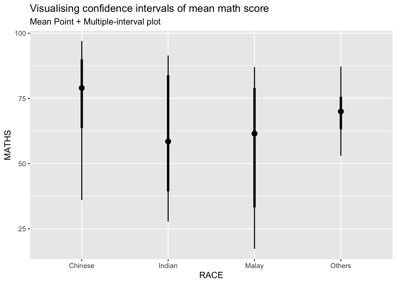
In the code chunk below, the following arguments are used:
.width = 0.95
.point = median
.interval = qi
exam %>%
  ggplot(aes(x = RACE, y = MATHS)) +
  stat_pointinterval(.width = 0.95,
  .point = median,
  .interval = qi) +
  labs(
    title = "Visualising confidence intervals of median math score",
    subtitle = "Median Point + Multiple-interval plot")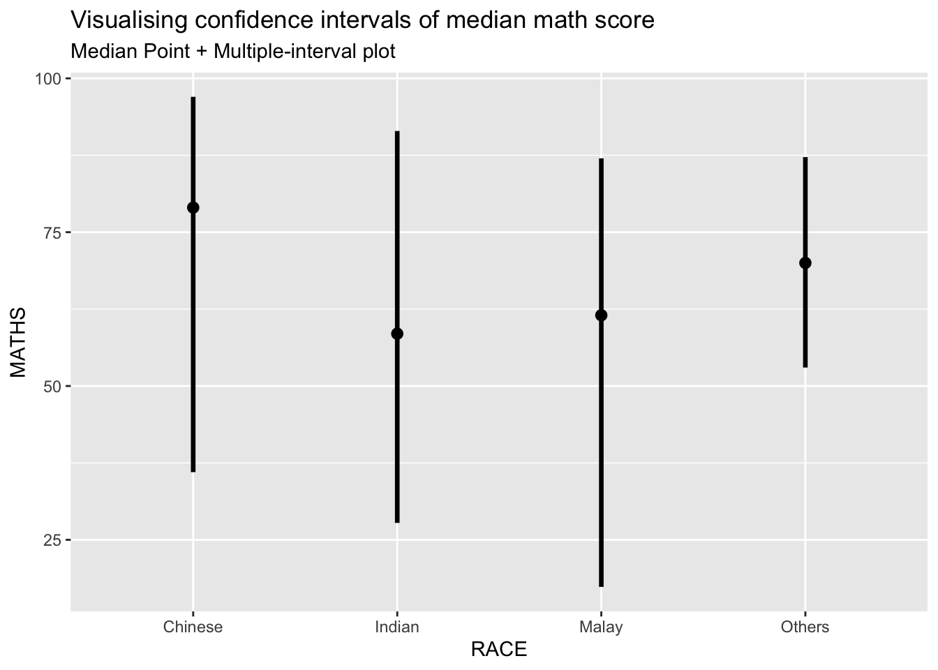
Plot with 99% confidence interval
Makeover the plot showing 95% and 99% confidence intervals.
exam %>%
  ggplot(aes(x = RACE,
             y = MATHS)) +
  stat_pointinterval(.width = 0.99,
                     .point = mean,
                     .interval = qi,
    show.legend = FALSE) +
  labs(
    title = "Visualising confidence intervals of mean math score",
    subtitle = "Mean Point + Multiple-interval plot")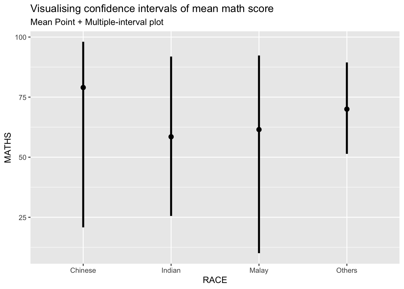
4.2. Visualizing the uncertainty of point estimates: ggdist methods
exam %>%
  ggplot(aes(x = RACE,
             y = MATHS)) +
  stat_pointinterval(
    show.legend = FALSE) +
  labs(
    title = "Visualising confidence intervals of mean math score",
    subtitle = "Mean Point + Multiple-interval plot")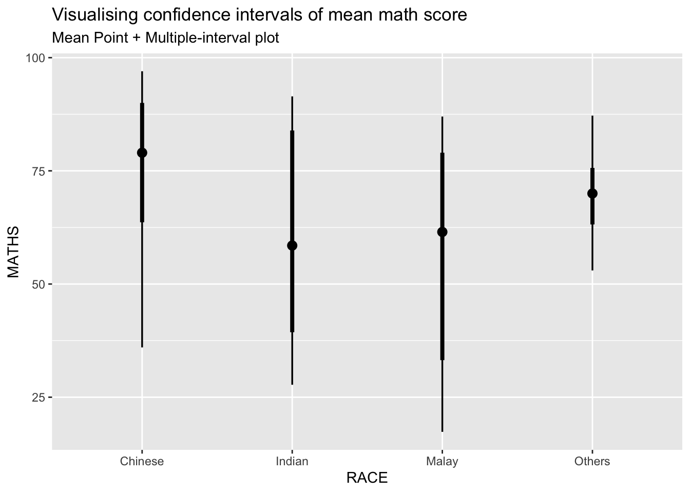
Note
This function comes with many arguments, it is recommended to read the syntax reference for more details
4.3. Visualizing the uncertainty of point estimates: ggdist methods
The code chunk below uses stat_gradientinterval() of ggdist is used to build a visual for displaying distribution of maths scores by race.
exam %>%
  ggplot(aes(x = RACE,
             y = MATHS)) +
  stat_gradientinterval(
    fill = "skyblue",
    show.legend = TRUE
  ) +
  labs(
    title = "Visualising confidence intervals of mean math score",
    subtitle = "Gradient + interval plot")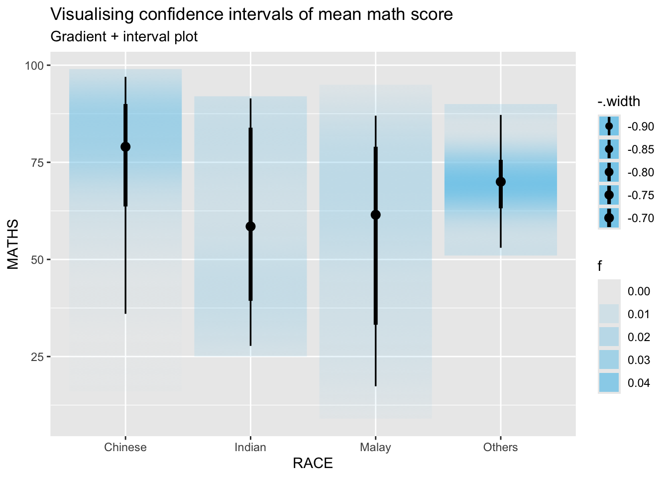
Note
This function comes with many arguments, it is recommended to read the syntax reference for more details
5. Visualising Uncertainty with Hypothetical Outcome Plots (HOPs)
First we install ungeviz package using below code chunk. This step only needs to be performed once.
devtools::install_github("wilkelab/ungeviz")Next we launch the application in R.
devtools::install_github("wilkelab/ungeviz")ggplot(data = exam,
(aes(x = factor(RACE), y = MATHS))) +
geom_point(position = position_jitter(
height = 0.3, width = 0.05),
size = 0.4, color = "#0072B2", alpha = 1/2) +
geom_hpline(data = sampler(25, group = RACE), height = 0.6, color = "#D55E00") +
theme_bw() +
# `.draw` is a generated column indicating the sample draw
transition_states(.draw, 1, 3)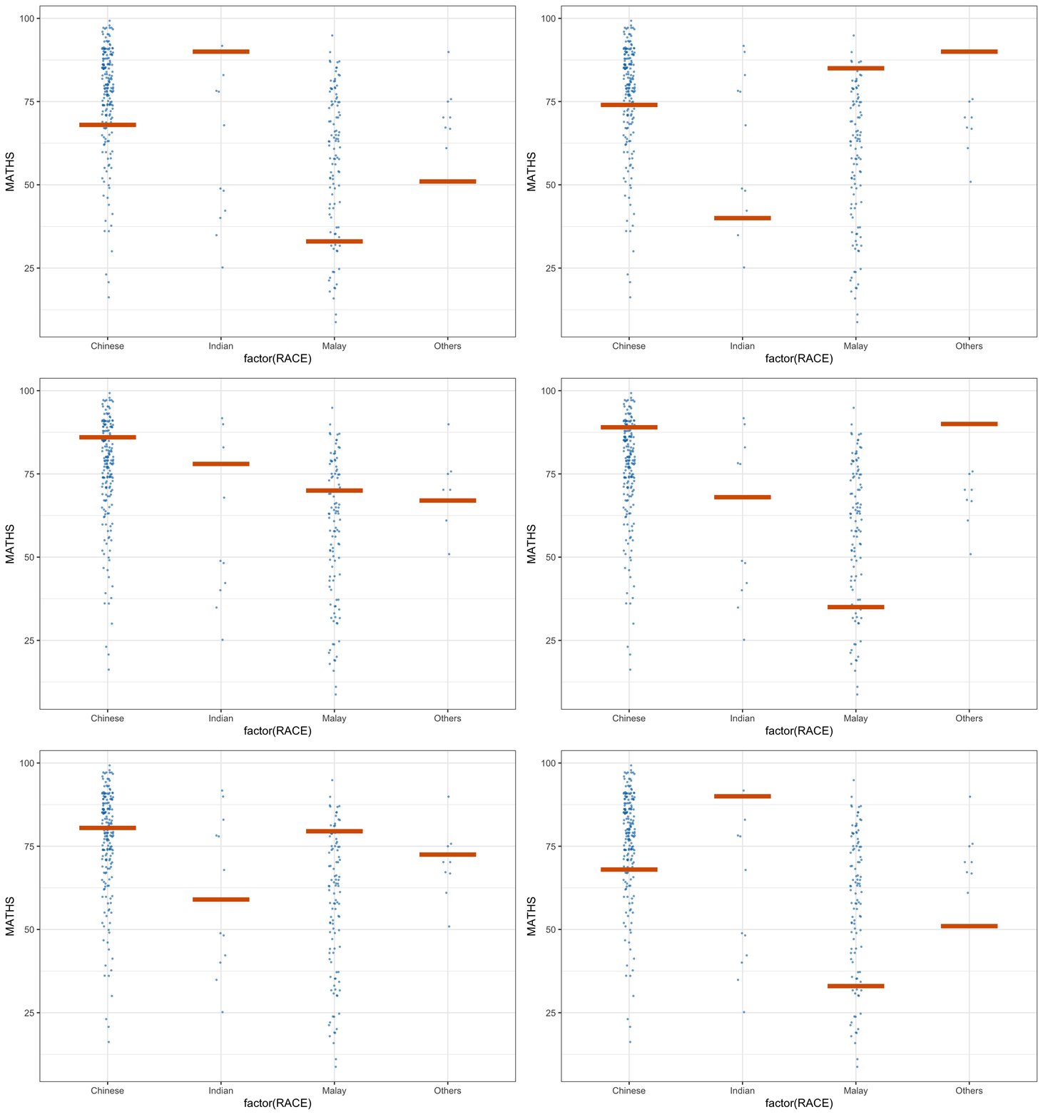
Practice: Point-interval plot with shaded ribbons across varying confidence levels
ci_levels <- c(0.25, 0.5, 0.75, 0.95, 1)

ci_data <- map_dfr(ci_levels, function(cl) {
  exam %>%
    group_by(GENDER) %>%
    summarise(
      .width = cl,
      lower = quantile(MATHS, probs = (1 - cl) / 2),
      upper = quantile(MATHS, probs = 1 - (1 - cl) / 2),
      mean = mean(MATHS),   # changed here
      .groups = "drop"
    ) %>%
    mutate(confidence = cl)
})

ggplot(ci_data, aes(x = confidence, y = mean, group = GENDER, color = GENDER, fill = GENDER)) +
  geom_ribbon(aes(ymin = lower, ymax = upper), alpha = 0.2, color = NA) +
  geom_pointrange(aes(ymin = lower, ymax = upper), size = 0.4) +
  scale_x_continuous(breaks = ci_levels, limits = c(0.25, 1)) +
  labs(
    title = "Mean MATHS Scores with Confidence Intervals by GENDER",
    subtitle = "Vertical bars + shaded ribbons represent uncertainty at each confidence level",
    x = "Confidence Level",
    y = "Mean MATHS Score",
    color = "GENDER",
    fill = "GENDER"
  ) +
  theme_minimal()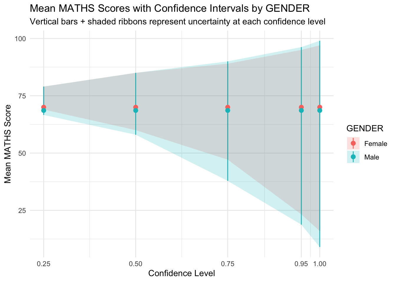
- The Male group shows slightly more uncertainty (wider bands) at higher levels.
- The overlap in ribbons suggests no strong difference in means between genders.