pacman::p_load(seriation, dendextend, heatmaply, tidyverse)Hands-on Exercise 9.3 - Heatmap for Visualising and Analysing Multivariate Data
1. Overview
Heatmaps use color variations to visualize multivariate data in a tabular format, with variables in columns and observations in rows. They effectively highlight variance, patterns, similarities, and correlations among variables.
In this exercise, we explore how to create both static and interactive heatmaps in R for multivariate data analysis.
2. Installing and Launching R Packages
The code chunk below installs seriation, heatmaply, dendextend and tidyverse packages in RStudio.
3. Importing and Preparing The Data Set
For this exercise, the data of World Happines 2018 report downloaded from here will be used. The original data set Microsoft Excel format was extracted and saved in WHData-2018.csv.
3.1. Importing the data set
The code chunk below use read_csv() to import WHData-2018.csv into R as a tibble data frame.
wh <- read_csv("data/WHData-2018.csv")3.2. Preparing the data
Next, we change the rows name to country name instead of row number using the code chunk below.
row.names(wh) <- wh$Country3.3.Transforming the data frame into a matrix
The data needs to be in data matrix format to plot the heatmap.
The code chunk below transforms wh data frame into a data matrix.
wh1 <- dplyr::select(wh, c(3, 7:12))
wh_matrix <- data.matrix(wh)
4. Static Heatmap
Several R packages offer functions for creating static heatmaps:
heatmap() (R stats package): Basic heatmap visualization.
heatmap.2() (gplots package): Enhanced version with more features.
pheatmap() (pheatmap package): “Pretty Heatmap” with greater customization.
ComplexHeatmap (Bioconductor package): Ideal for genomic data analysis.
superheat: Customizable heatmaps for complex and large datasets.
This section focuses on plotting static heatmaps using heatmap() from the R Stats package.
4.1. heatmap() of R Stats
The below code chunk plots a heatmap using heatmap() of Base Stats.
wh_heatmap <- heatmap(wh_matrix,
                      Rowv=NA, Colv=NA)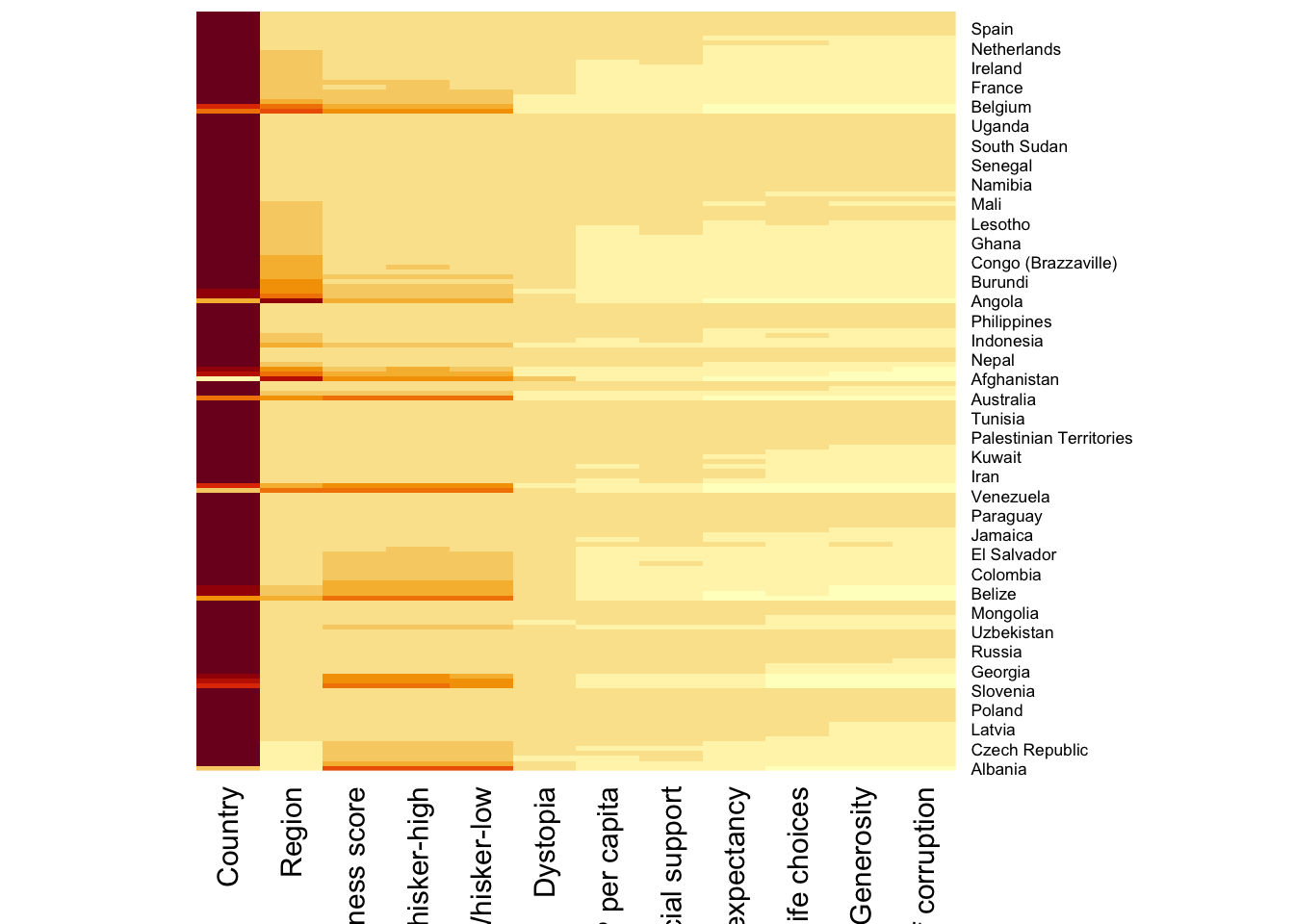
Note:
By default, heatmap() generates a clustered heatmap.
To disable row and column dendrograms, set
Rowv = NAandColv = NA.
To plot a clustered heatmap, simply use the default settings, as shown in the code below.
wh_heatmap <- heatmap(wh_matrix)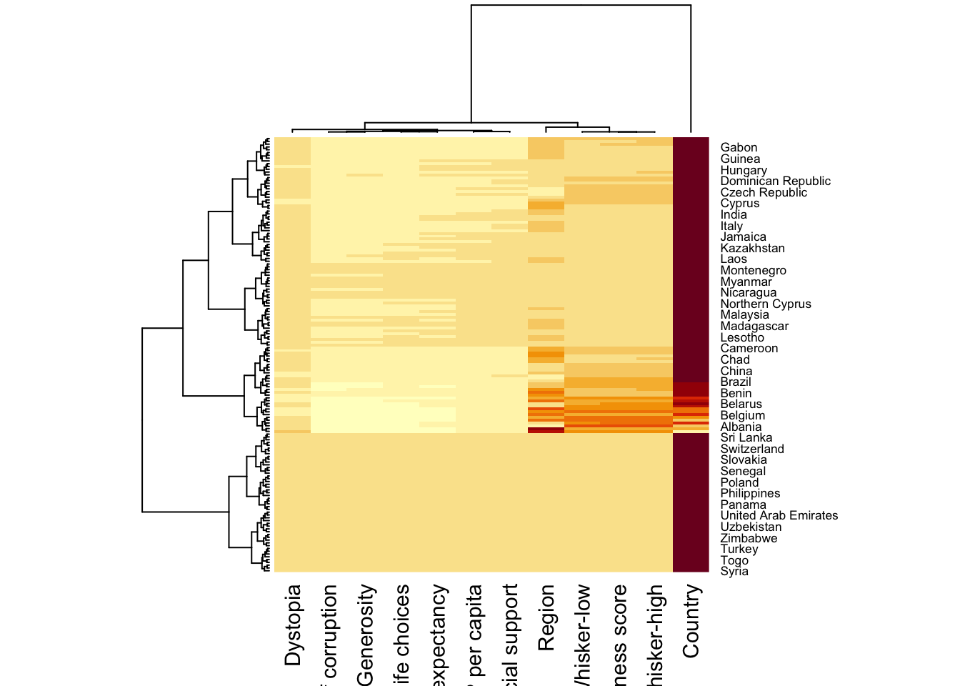
Note:
The order of rows and columns differs from the original
wh_matrixbecause heatmap() applies clustering, grouping similar values together. Corresponding dendrograms are displayed alongside the heatmap.Red cells indicate smaller values, while larger values appear in a different shade.
The heatmap may be misleading if one variable (e.g., Happiness Score) has much higher values than others. This can make smaller values look indistinguishable.
To address this, normalization is needed. The scale argument allows scaling by rows or columns.
The code below normalizes the matrix column-wise.
wh_heatmap <- heatmap(wh_matrix,
                      scale="column",
                      cexRow = 0.6,
                      cexCol = 0.8,
                      margins = c(10, 4))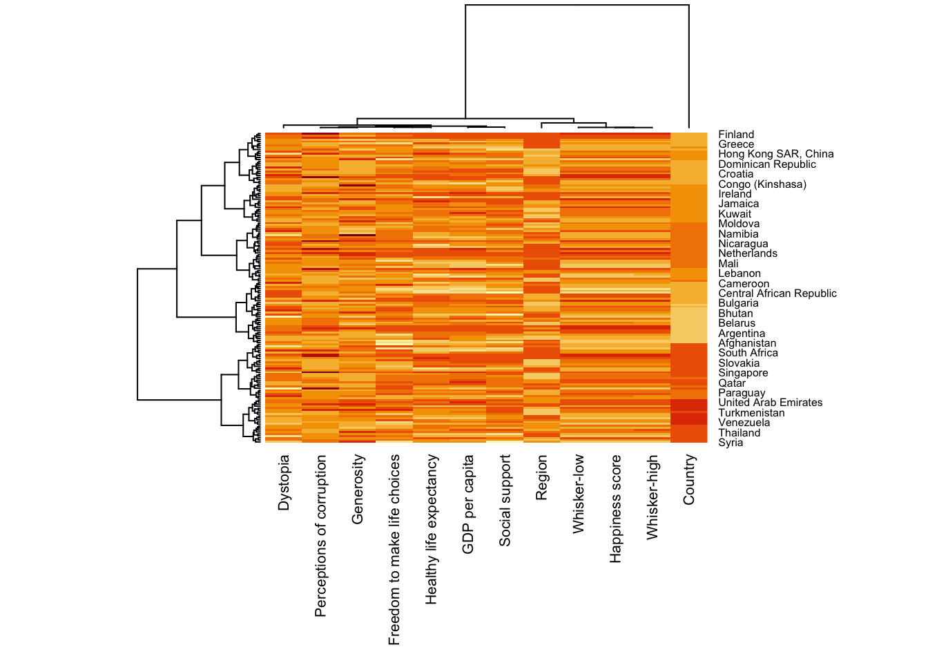
Note: The values are scalednow, making the heatmap more interpretable. The margins argument ensures that x-axis labels are fully visible. cexRow and cexCol control the font size for y-axis and x-axis labels, respectively.
5. Creating Interactive Heatmap
heatmaply is an R package for creating interactive cluster heatmaps that can be shared as standalone HTML files. Developed and maintained by Tal Galili, it extends traditional heatmaps with interactive features.
Before proceeding, review the Introduction to Heatmaply for an overview of its capabilities and keep the user manual handy for reference.
In this section, we explore using heatmaply to design an interactive cluster heatmap, using wh_matrix as the input data.
5.1. Working with heatmaply
The code chunk below creates an interactive heatmap using basic syntax from heatmaply.
heatmaply(wh_matrix[, -c(1, 2, 4, 5)])Notes
Unlike
heatmap(), the horizontal dendrogram in heatmaply() is positioned on the left of the heatmap.Row text labels are displayed on the right of the heatmap.
Long x-axis labels are rotated 135 degrees for better readability.
5.2. Data trasformation
Multivariate datasets often contain variables with different measurement scales, making direct comparisons difficult. To address this, heatmaply() supports three main data transformation methods: Scaling (Standardization), Normalization and Percentilization.
5.2.1 Scaling method
When variables are assumed to follow a normal distribution, scaling helps standardize them by subtracting the mean and dividing by the standard deviation. This transformation ensures all variables are comparable and centered around zero.
heatmaply() supports column-wise and row-wise scaling via the scale argument. The code chunk below demonstrates how to apply column-wise scaling in heatmaply().
heatmaply(wh_matrix[, -c(1, 2, 4, 5)],
          scale = "column")
5.2.2.Normalising method
When variables come from different, possibly non-normal distributions, normalization transforms the data to a 0 to 1 scale by subtracting the minimum and dividing by the maximum of all records. This transformation preserves the shape of each variable’s distribution while making them comparable on a common scale.
Unlike scaling, normalization is applied directly to the input dataset (e.g., wh_matrix). The code chunk below demonstrates how to normalize the dataset before generating a heatmap.
heatmaply(normalize(wh_matrix[, -c(1, 2, 4, 5)]))5.2.3.Percentising method
The percentile transformation (percentize method) ranks variables and scales them between 0 and 1 by applying the empirical cumulative distribution function (ECDF) to each value. This means each transformed value represents the percentage of observations that have that value or lower.
Similar to the normalize method, percentize is applied directly to the input dataset (e.g., wh_matrix). The code chunk below demonstrates how to apply percentile transformation before generating a heatmap with heatmaply().
heatmaply(percentize(wh_matrix[, -c(1, 2, 4, 5)]))5.3. Clustering algorithm
heatmaply provides various hierarchical clustering algorithms to group similar rows and columns in a heatmap. The key arguments include:
distfun: Defines the distance metric (default:dist). Options include"pearson","spearman", and"kendall"for correlation-based clustering.hclustfun: Defines the hierarchical clustering method (default:hclust).dist_method: Specifies the distance calculation method (default:"euclidean"). Other options include"manhattan","canberra","minkowski", etc.hclust_method: Specifies the clustering linkage method (default:"complete"). Options include"ward.D","single","average","centroid", etc.
5.4.Manual approach
The following code demonstrates how to manually set Euclidean distance and Ward’s method (ward.D) for hierarchical clustering.
heatmaply(normalize(wh_matrix[, -c(1, 2, 4, 5)]),
          dist_method = "euclidean",
          hclust_method = "ward.D")
5.5.Statistical approach
To identify the optimal clustering method and number of clusters, the dendextend package provides two useful functions:
dend_expend(): Recommends the best clustering method by evaluating the stability of different hierarchical clustering approaches.find_k(): Helps determine the optimal number of clusters by analyzing the dendrogram structure.
First the dend_expend() function is used to compare various clustering methods and suggest the most suitable one.
wh_d <- dist(normalize(wh_matrix[, -c(1, 2, 4, 5)]), method = "euclidean")
dend_expend(wh_d)[[3]]
dist_methods hclust_methods optim
1 unknown ward.D 0.6137851
2 unknown ward.D2 0.6289186
3 unknown single 0.4774362
4 unknown complete 0.6434009
5 unknown average 0.6701688
6 unknown mcquitty 0.5020102
7 unknown median 0.5901833
8 unknown centroid 0.6338734The output table shows that “average” method should be used as it gives the highest optimum value.
Next, find_k() is used to determine the optimal number of cluster.
wh_clust <- hclust(wh_d, method = "average")
num_k <- find_k(wh_clust)
plot(num_k)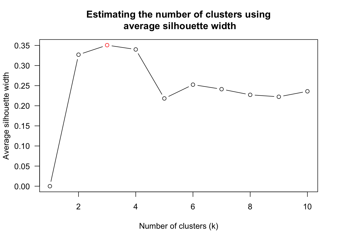
The figure above shows that k=3 would be good.
The code chunk below is composed with reference to the statistical analysis results.
heatmaply(normalize(wh_matrix[, -c(1, 2, 4, 5)]),
          dist_method = "euclidean",
          hclust_method = "average",
          k_row = 3)
5.6.Seriation
A common limitation of hierarchical clustering is that it does not provide a definite ordering of rows and columns in the heatmap. While the dendrogram constrains the order, it does not determine the optimal arrangement for visual clarity.
To address this, heatmaply leverages the seriation package to optimize row and column ordering using the Optimal Leaf Ordering (OLO) algorithm.
How OLO Works:
OLO minimizes the sum of distances between adjacent leaves in the dendrogram.
It reorders clusters to enhance the readability of the heatmap.
This optimization is similar to solving a restricted Traveling Salesman Problem (TSP) for arranging the branches of the dendrogram.
Applying OLO results in a clearer, more interpretable heatmap by minimizing unnecessary reordering within clusters.
heatmaply(normalize(wh_matrix[, -c(1, 2, 4, 5)]),
          seriate = "OLO")
By default, heatmaply uses the Optimal Leaf Ordering (OLO) method, which optimizes the ordering of clusters to enhance heatmap clarity. This method runs in O(n⁴) time complexity.
An alternative is the Gruvaeus and Wainer (GW) heuristic, which also aims to improve ordering but operates more efficiently in certain cases.
heatmaply(normalize(wh_matrix[, -c(1, 2, 4, 5)]),
          seriate = "GW")
The option seriate = "mean" gives the output we would get by default from heatmap functions in other packages such as gplots::heatmap.2.
heatmaply(normalize(wh_matrix[, -c(1, 2, 4, 5)]),
          seriate = "mean")
The option “none” gives us the dendrograms without any rotation that is based on the data matrix.
heatmaply(normalize(wh_matrix[, -c(1, 2, 4, 5)]),
          seriate = "none")
5.7.Working with colour palettes
By default, heatmaply uses the viridis color palette. However, users can customize the color scheme to enhance aesthetics and readability.
In the example below, the Blues palette from the RColorBrewer package is applied.
heatmaply(normalize(wh_matrix[, -c(1, 2, 4, 5)]),
          seriate = "none",
          colors = Blues)
5.8.The finishing touch
heatmaply offers extensive customization options to enhance both statistical analysis and visual quality.
In the example below:
k_rowcreates 5 row clusters.marginsadjusts the top margin (60) and row margin (200).fontsize_rowandfontsize_colset row and column label sizes to 4.main,xlab, andylabdefine the plot title and axis labels.
heatmaply(normalize(wh_matrix[, -c(1, 2, 4, 5)]),
          Colv=NA,
          seriate = "none",
          colors = Blues,
          k_row = 5,
          margins = c(NA,200,60,NA),
          fontsize_row = 4,
          fontsize_col = 5,
          main="World Happiness Score and Variables by Country, 2018 \nDataTransformation using Normalise Method",
          xlab = "World Happiness Indicators",
          ylab = "World Countries"
          )