pacman::p_load(GGally, parallelPlot, tidyverse)Hands-on Exercise 9.4 - Visual Multivariate Analysis with Parallel Coordinates Plot
1. Overview
Parallel coordinates plots are designed for visualizing multivariate numerical data, making it easier to compare multiple variables and identify relationships. Originally developed by Alfred Inselberg in the 1970s, this technique is widely used in academic and scientific analysis rather than general business reporting. As Stephen Few (2006) noted, parallel coordinates plots are most effective for interactive data exploration rather than for presenting findings to a broad audience.
In this hands-on exercise, we will explore:
Create static parallel coordinates plots using
ggparcoord()from the GGally package.Build interactive plots with the parcoords package.
Use the parallelPlot package for further interactive visualization.
2. Installing and Launching R Packages
The code chunk below installs GGally, parcoords, parallelPlot and tidyverse packages into R environment.
3. Data Preparation
For this exercise, the data of World Happines 2018 report downloaded from here will be used. The original data set Microsoft Excel format was extracted and saved in WHData-2018.csv.
The code below imports the dataset into R as a tibble using read_csv() from the readr package.
wh <- read_csv("data/WHData-2018.csv")4. Plotting Static Parallel Coordinates Plot
In this section, we explore creating static parallel coordinates plots using ggparcoord() of GGally package. It’s recommended to review the function documentation for better understanding.
4.1.Plotting a simple parallel coordinates
The code chunk below plots a basic static parallel coordinates plot using ggparcoord().
ggparcoord(data = wh,
           columns = c(7:12))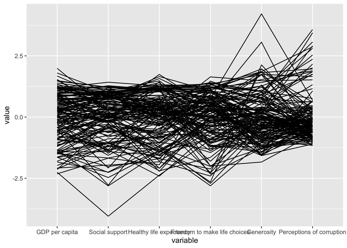
The basic parallel coordinates plot only uses two main arguments:
data: Maps the dataset (e.g.,wh).columns: Selects the variables for the parallel coordinates plot.
4.2.Plotting a parallel coordinates with boxplot
The basic plot may not effectively reveal insights into World Happiness measures. In this section, w4e explore how to refine the visualization using additional arguments provided by ggparcoord().
ggparcoord(data = wh,
           columns = c(7:12),
           groupColumn = 2,
           scale = "uniminmax",
           alphaLines = 0.2,
           boxplot = TRUE,
           title = "Parallel Coordinates Plot of World Happines Variables")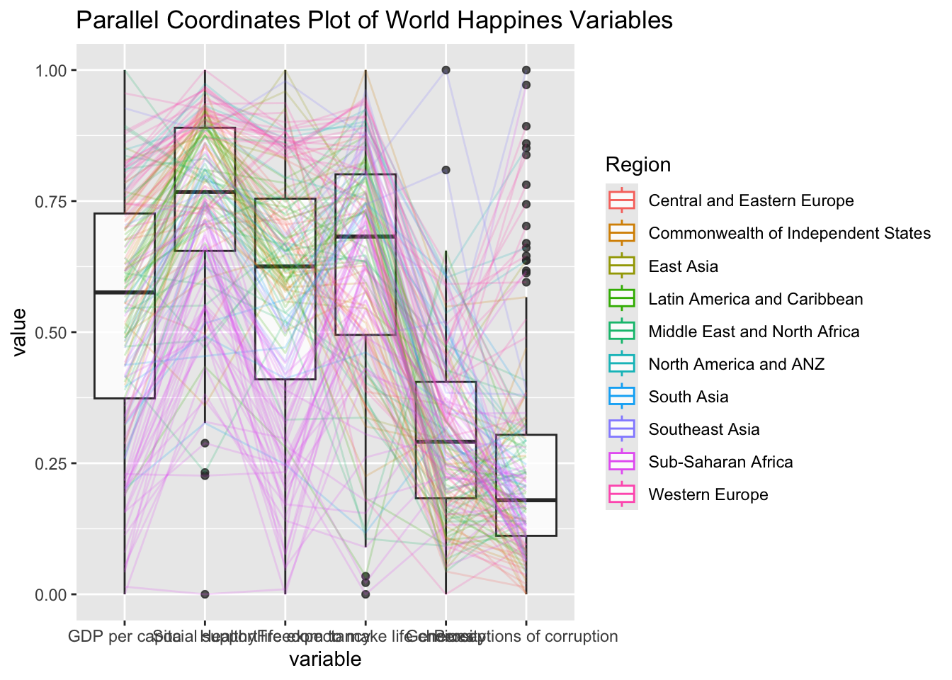
Key takeaways from the above code chunk
The
groupColumnargument groups observations by a variable (e.g., Region) and colors the lines accordingly.The
scaleargument uses the uniminmax method to scale each variable between 0 and 1.The
alphaLinesargument adjusts line transparency, with a value of 0.2 in this case (valid range: 0-1).The
boxplotargument enables boxplots withTRUE(default:FALSE).The
titleargument adds a title to the parallel coordinates plot.
4.3.Parallel coordinates with facet
Since ggparcoord() extends the ggplot2 package, it allows integration with ggplot2 functions. In the code chunk below, facet_wrap() is used to create multiple small parallel coordinates plots, each representing a different geographical region, such as East Asia.
ggparcoord(data = wh,
           columns = c(7:12),
           groupColumn = 2,
           scale = "uniminmax",
           alphaLines = 0.2,
           boxplot = TRUE,
           title = "Multiple Parallel Coordinates Plots of World Happines Variables by Region") +
  facet_wrap(~ Region)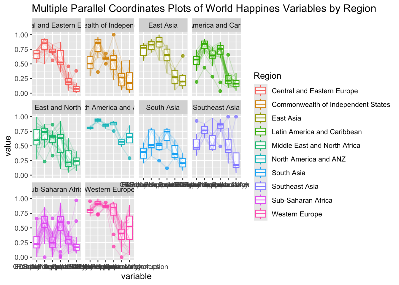
4.4.Rotating x-axis text label
To make the x-axis text label easy to read, we rotate the labels by 30 degrees. We can rotate axis text labels using theme() function in ggplot2 as shown in the code chunk below.
ggparcoord(data = wh,
           columns = c(7:12),
           groupColumn = 2,
           scale = "uniminmax",
           alphaLines = 0.2,
           boxplot = TRUE,
           title = "Multiple Parallel Coordinates Plots of World Happines Variables by Region") +
  facet_wrap(~ Region) +
  theme(axis.text.x = element_text(angle = 30))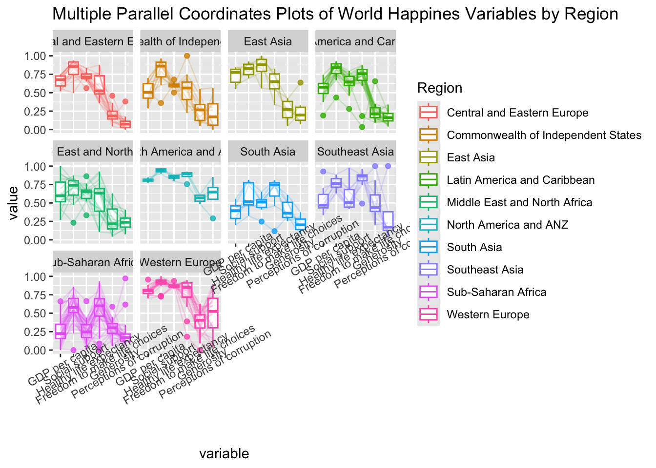
To rotate x-axis text labels, axis.text.x argument of theme() function was used, specifying element_text(angle = 30) to rotate the x-axis text by an angle 30 degree.
4.5.Adjusting the rotated x-axis text label
Rotating x-axis text labels to 30 degrees may cause overlap with the plot. To avoid this, the text position can be adjusted using the hjust argument within element_text() in the theme() function. The axis.text.x element is used to modify the appearance of x-axis text.
ggparcoord(data = wh,
           columns = c(7:12),
           groupColumn = 2,
           scale = "uniminmax",
           alphaLines = 0.2,
           boxplot = TRUE,
           title = "Multiple Parallel Coordinates Plots of World Happines Variables by Region") +
  facet_wrap(~ Region) +
  theme(axis.text.x = element_text(angle = 30, hjust=1))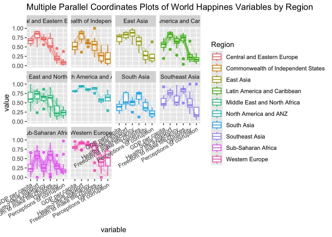
5.Plotting Interactive Parallel Coordinates Plot: parallelPlot methods
The parallelPlot package in R leverages htmlwidgets and d3.js to create interactive parallel coordinates plots. The following section demonstrates how to use its functions to build such visualizations.
5.1.The basic plot
The code chunk below plots an interactive parallel coordinates plot using parallelPlot().
wh <- wh %>%
  select("Happiness score", c(7:12))
parallelPlot(wh,
             width = 320,
             height = 250)
Notice that some of the axis labels are too long. We will overcome this problem in the next step.
5.2.Rotate axis label
In the code chunk below, rotateTitle argument is used to avoid overlapping axis labels.
parallelPlot(wh,
             rotateTitle = TRUE)
As the parallel plot is interactive, we can click on a variable of interest, for example Happiness score, the monotonous blue colour (default) will change to blues with different intensity.
5.3.Changing the colour scheme
We can change the default blue colour scheme using continousCS argument as shown in the code chunk below.
parallelPlot(wh,
             continuousCS = "YlOrRd",
             rotateTitle = TRUE)
5.4.Parallel coordinates plot with histogram
In the code chunk below, histoVisibility argument is used to plot histogram along the axis of each variables.
histoVisibility <- rep(TRUE, ncol(wh))
parallelPlot(wh,
             rotateTitle = TRUE,
             histoVisibility = histoVisibility)
6.References
ggparcoord() of GGally package