pacman::p_load(tidyverse, FunnelPlotR, plotly, knitr)Hands-on Exercise 4.4 - Funnel Plots for Fair Comparisons
1. Overview
A funnel plot is a specialized data visualization tool designed for making unbiased comparisons between outlets, stores, or business entities. This hands-on exercise provides practical experience in:
Creating funnel plots using the
funnelPlotRpackage.Generating static funnel plots with
ggplot2.Developing interactive funnel plots by combining
plotlyandggplot2.
2. Installing and Launching R Packages
For this exercise, we will use four R packages as below:
readr for importing csv into R.
FunnelPlotR for creating funnel plot.
ggplot2 for creating funnel plot manually.
knitr for building static html table.
plotly for creating interactive funnel plot.
3. Importing Data
In this section, COVID-19_DKI_Jakarta will be used. The data was downloaded from Open Data Covid-19 Provinsi DKI Jakarta portal. We are going to compare the cumulative COVID-19 cases and death by sub-district (i.e. kelurahan) as of 31st July 2021, DKI Jakarta.
The code chunk below imports the data into R and save it into a tibble data frame called covid19.
covid19 <- read_csv("data/COVID-19_DKI_Jakarta.csv") %>%
  mutate_if(is.character, as.factor)
4. FunnelPlotR methods
The funnelPlotR package utilizes ggplot2 to generate funnel plots. It requires three key inputs:
Numerator: The number of events of interest.
Denominator: The total population being considered.
Group: The categorical grouping variable.
Key customization options include:
limit: Specifies plot limits (e.g., 95% or 99% confidence limits).
label_outliers: Determines whether outliers should be labeled (
TRUEorFALSE).Poisson_limits: Adds Poisson confidence limits to the plot.
OD_adjust: Applies overdispersion-adjusted limits.
xrange & yrange: Defines the display range for axes, acting as a zoom function.
Aesthetic components: Customizations such as graph title, axis labels, and other stylistic elements.
4.1. FunnelPlotR methods: The basic plot
The code chunk below plots a funnel plot.
funnel_plot(
  .data = covid19,
  numerator = Positive,
  denominator = Death,
  group = `Sub-district`
)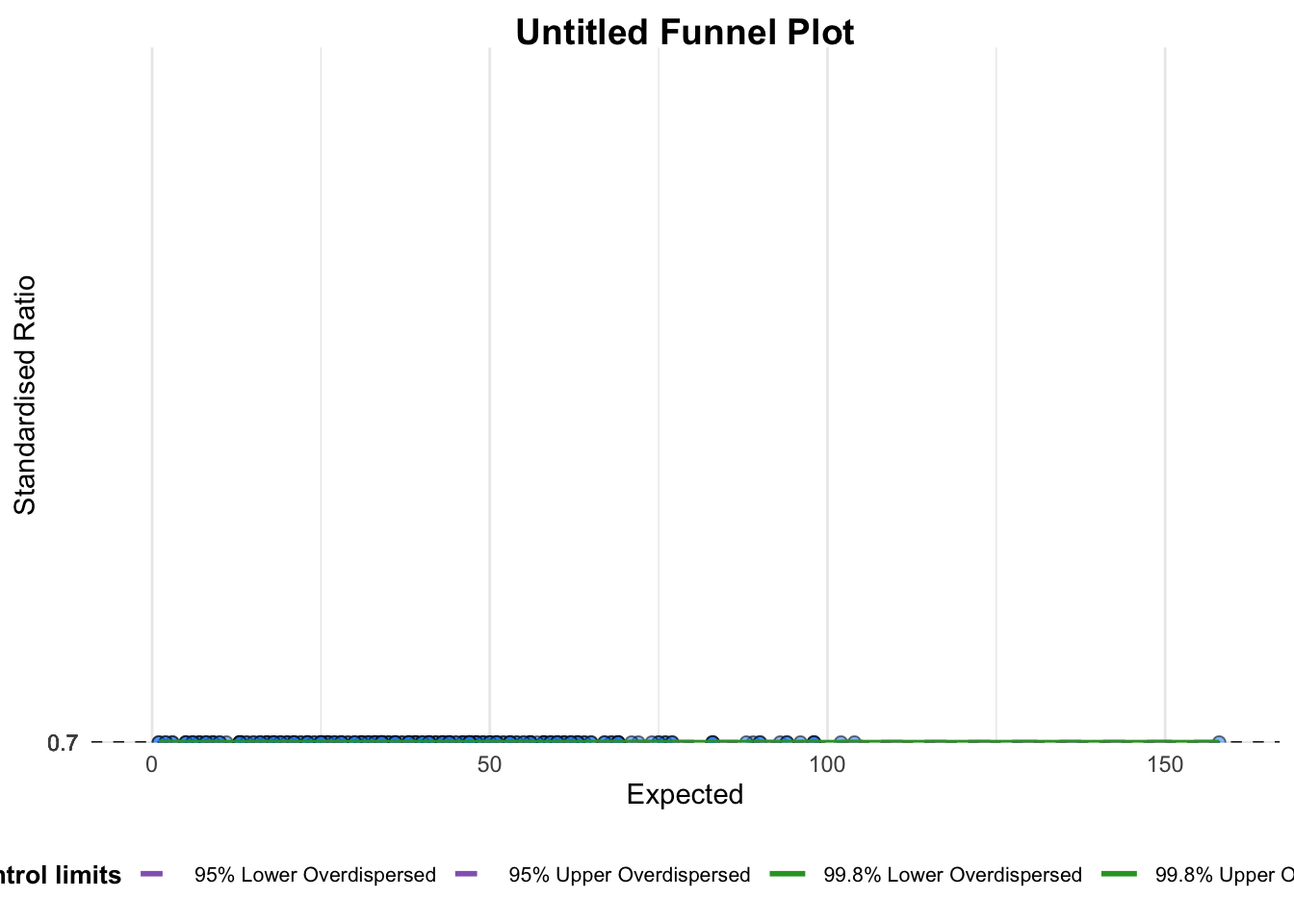
A funnel plot object with 267 points of which 0 are outliers.
Plot is adjusted for overdispersion.
Key Takeaways from the Code Chunk:
Group Definition: Unlike in a scatterplot, the
groupargument here determines the level at which data points are plotted (e.g., Sub-district, District, or City). If “City” is selected, only six data points will be displayed.Data Type: The
data_typeargument defaults to"SR".Plot Limits (
limit): Defines confidence limits for the funnel plot. Acceptable values are95(95% confidence interval) or99(99.8% confidence interval).
4.2. FunnelPlotR methods: Makeover 1
The code chunk below plots a funnel plot.
funnel_plot(
  .data = covid19,
  numerator = Death,
  denominator = Positive,
  group = `Sub-district`,
  data_type = "PR",     #<<
  x_range = c(0, 6500),  #<<
  y_range = c(0, 0.05)   #<<
)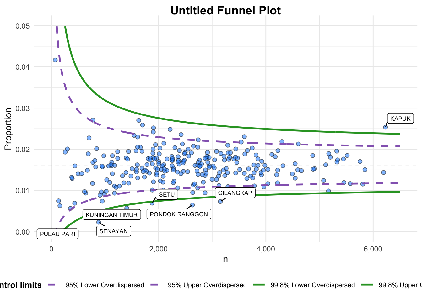
A funnel plot object with 267 points of which 7 are outliers.
Plot is adjusted for overdispersion.
Key takeaways from the above code chunk:
data_typeargument is used to change from default “SR” to “PR” (i.e. proportions).xrangeandyrangeare used to set the range of x-axis and y-axis
4.3. FunnelPlotR methods: Makeover 2
The code chunk below plots a funnel plot.
funnel_plot(
  .data = covid19,
  numerator = Death,
  denominator = Positive,
  group = `Sub-district`,
  data_type = "PR",
  x_range = c(0, 6500),
  y_range = c(0, 0.05),
  label = NA,
  title = "Cumulative COVID-19 Fatality Rate by Cumulative Total Number of COVID-19 Positive Cases", #<<
  x_label = "Cumulative COVID-19 Positive Cases", #<<
  y_label = "Cumulative Fatality Rate"  #<<
)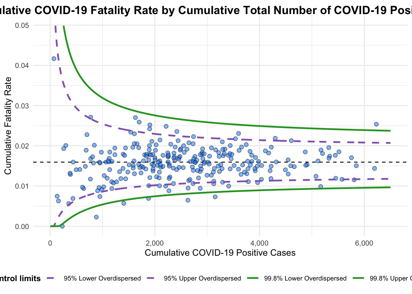
A funnel plot object with 267 points of which 7 are outliers.
Plot is adjusted for overdispersion.
Key arguments from the above code chunk:
label = NAremoves the default label outliers feature.titleadds plot title.x_labelandy_labeladd/edit x-axis and y-axis titles.
5. Funnel Plot for Fair Visual Comparison: ggplot2 methods
In this section, we explore how to build funnel plots step-by-step using ggplot2.
5.1. Computing the basic derived fields
First we derive cumulative death rate and standard error of cumulative death rate using below code chunk.
df <- covid19 %>%
  mutate(rate = Death / Positive) %>%
  mutate(rate.se = sqrt((rate*(1-rate)) / (Positive))) %>%
  filter(rate > 0)
Next, fit.mean is computed using the code chunk below.
fit.mean <- weighted.mean(df$rate, 1/df$rate.se^2)5.2. Calculate lower and upper limits for 95% and 99.9% CI
The below code chunk below computes the lower and upper limits for 95% confidence interval.
number.seq <- seq(1, max(df$Positive), 1)
number.ll95 <- fit.mean - 1.96 * sqrt((fit.mean*(1-fit.mean)) / (number.seq))
number.ul95 <- fit.mean + 1.96 * sqrt((fit.mean*(1-fit.mean)) / (number.seq))
number.ll999 <- fit.mean - 3.29 * sqrt((fit.mean*(1-fit.mean)) / (number.seq))
number.ul999 <- fit.mean + 3.29 * sqrt((fit.mean*(1-fit.mean)) / (number.seq))
dfCI <- data.frame(number.ll95, number.ul95, number.ll999,
                   number.ul999, number.seq, fit.mean)
5.3. Plotting a static funnel plot
The code chunk below uses ggplot2 functions are used to plot a static funnel plot.
p <- ggplot(df, aes(x = Positive, y = rate)) +
  geom_point(aes(label=`Sub-district`),
             alpha=0.4) +
  geom_line(data = dfCI,
            aes(x = number.seq,
                y = number.ll95),
            size = 0.4,
            colour = "grey40",
            linetype = "dashed") +
  geom_line(data = dfCI,
            aes(x = number.seq,
                y = number.ul95),
            size = 0.4,
            colour = "grey40",
            linetype = "dashed") +
  geom_line(data = dfCI,
            aes(x = number.seq,
                y = number.ll999),
            size = 0.4,
            colour = "grey40") +
  geom_line(data = dfCI,
            aes(x = number.seq,
                y = number.ul999),
            size = 0.4,
            colour = "grey40") +
  geom_hline(data = dfCI,
             aes(yintercept = fit.mean),
             size = 0.4,
             colour = "grey40") +
  coord_cartesian(ylim=c(0,0.05)) +
  annotate("text", x = 1, y = -0.13, label = "95%", size = 3, colour = "grey40") +
  annotate("text", x = 4.5, y = -0.18, label = "99%", size = 3, colour = "grey40") +
  ggtitle("Cumulative Fatality Rate by Cumulative Number of COVID-19 Cases") +
  xlab("Cumulative Number of COVID-19 Cases") +
  ylab("Cumulative Fatality Rate") +
  theme_light() +
  theme(plot.title = element_text(size=12),
        legend.position = c(0.91,0.85),
        legend.title = element_text(size=7),
        legend.text = element_text(size=7),
        legend.background = element_rect(colour = "grey60", linetype = "dotted"),
        legend.key.height = unit(0.3, "cm"))
p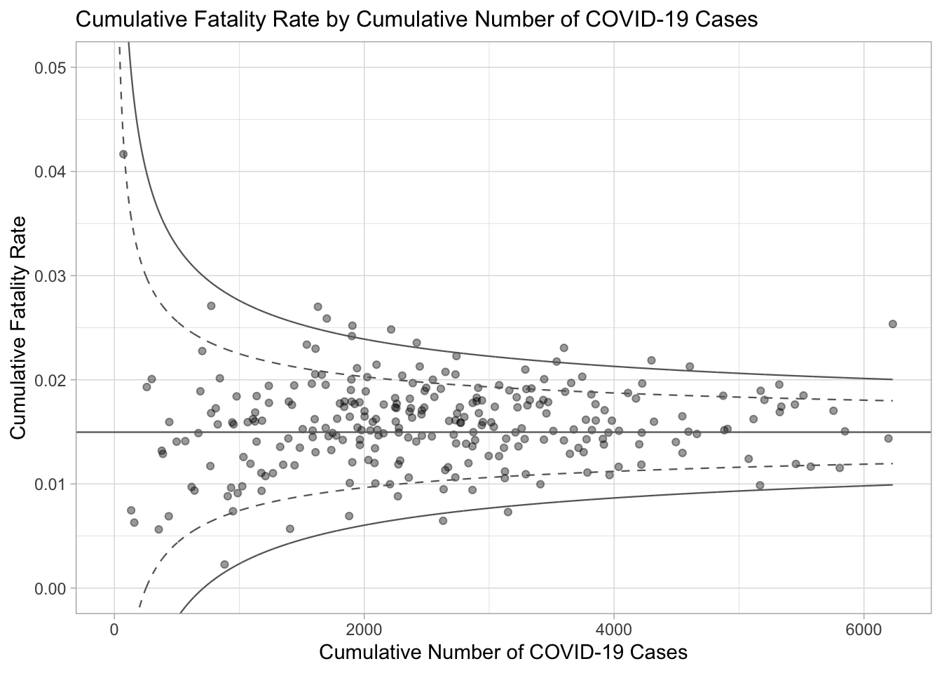
5.4. Interactive Funnel Plot: plotly + ggplot2
The funnel plot created using ggplot2 functions can be made interactive with ggplotly() of plotly package.
fp_ggplotly <- ggplotly(p,
  tooltip = c("label",
              "x",
              "y"))
fp_ggplotly